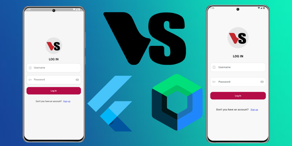
Creating a login ui screen in Flutter vs. Kotlin
Code available in


In this tutorial, we’ll walk through the creation of a simple login screen using the Flutter framework. The screen will include a header image, a title, a login form, and a footer. Let’s dive into the details of each section of our code.
LoginScreen Class
The LoginScreen class is the main entry point of our login screen. It is a stateless widget that defines the structure of the login screen.
import 'package:flutter/material.dart';

class LoginScreen extends StatelessWidget {
  const LoginScreen({super.key});

  @override
  Widget build(BuildContext context) {
    return Scaffold(
      backgroundColor: const Color.fromARGB(255, 246, 246, 246),
      body: Padding(
        padding: const EdgeInsets.all(20.0),
        child: Column(
          mainAxisAlignment: MainAxisAlignment.center,
          crossAxisAlignment: CrossAxisAlignment.center,
          children: const [
            HeaderImageLogin(),
            SizedBox(height: 15),
            TitleLogin(),
            SizedBox(height: 15),
            FormLogin(),
            SizedBox(height: 20),
            FooterLogin(),
          ],
        ),
      ),
    );
  }
}
- Scaffold: Provides a basic structure for the visual interface.
- Padding: Adds space around the content.
- Column: Arranges the child widgets vertically.
- Children Widgets: These include
HeaderImageLogin,TitleLogin,FormLogin, andFooterLogin, each separated by aSizedBoxfor spacing.
TitleLogin Class
The TitleLogin class displays the title of the login screen.
class TitleLogin extends StatelessWidget {
  const TitleLogin({
    Key? key,
  }) : super(key: key);

  @override
  Widget build(BuildContext context) {
    return const Text(
      "LOG IN",
      style: TextStyle(
        fontSize: 20,
        fontWeight: FontWeight.bold,
      ),
    );
  }
}
- Text Widget: Displays the text “LOG IN”.
- TextStyle: Customizes the appearance of the text, setting the font size to 20 and making it bold.
HeaderImageLogin Class
The HeaderImageLogin class displays an image at the top of the login screen.
class HeaderImageLogin extends StatelessWidget {
  const HeaderImageLogin({super.key});

  @override
  Widget build(BuildContext context) {
    return Container(
      height: 150,
      decoration: const BoxDecoration(
        image: DecorationImage(
          image: AssetImage('assets/img/logo.png'),
          fit: BoxFit.contain,
        ),
      ),
    );
  }
}
- Container: A versatile widget used to contain the image.
- BoxDecoration: Provides decoration for the container, including the image.
- DecorationImage: Sets the image to be displayed within the container.
PasswordField Class
The PasswordField class defines a text field for entering a password.
class PasswordField extends StatelessWidget {
  const PasswordField({
    Key? key,
  }) : super(key: key);

  @override
  Widget build(BuildContext context) {
    return TextField(
      keyboardType: TextInputType.visiblePassword,
      maxLines: 1,
      decoration: InputDecoration(
        hintText: 'Password',
        filled: true,
        fillColor: Colors.white,
        border: OutlineInputBorder(
          borderRadius: BorderRadius.circular(16.0),
        ),
        enabledBorder: OutlineInputBorder(
          borderRadius: BorderRadius.circular(16.0),
          borderSide: const BorderSide(
            color: Color(0xFFCECECE),
          ),
        ),
        focusedBorder: OutlineInputBorder(
          borderRadius: BorderRadius.circular(16.0),
          borderSide: const BorderSide(
            color: Color(0xFF6977FF),
          ),
        ),
        prefixIcon: const Icon(
          Icons.key_outlined,
          color: Color(0xFFCECECE),
        ),
        suffixIcon: const IconButton(
          icon: Icon(
            Icons.visibility,
            color: Color(0xFFB8B8B8),
          ),
          onPressed: null,
        ),
      ),
    );
  }
}
- TextField: Allows the user to enter text.
- InputDecoration: Customizes the appearance of the text field, including hint text, border styles, and icons.
ButtonLogin Class
The ButtonLogin class defines a button for submitting the login form.
class ButtonLogin extends StatelessWidget {
  const ButtonLogin({
    Key? key,
  }) : super(key: key);

  @override
  Widget build(BuildContext context) {
    return SizedBox(
      width: double.infinity,
      height: 48,
      child: ElevatedButton(
        onPressed: () {},
        style: ElevatedButton.styleFrom(
          elevation: 0,
          backgroundColor: const Color(0xFFB40C47),
          shape: RoundedRectangleBorder(
            borderRadius: BorderRadius.circular(16),
          ),
        ),
        child: const Text(
          'Log In',
          style: TextStyle(
            color: Colors.white,
          ),
        ),
      ),
    );
  }
}
- SizedBox: Constrains the size of the button.
- ElevatedButton: A material design button that elevates when pressed.
- styleFrom: Customizes the button’s appearance, including background color, elevation, and border radius.
- onPressed: Specifies the callback function to be executed when the button is pressed.
login ui flutter