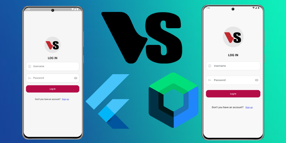
Login screen ui in Jetpack Compose vs Flutter


Creating a Login Screen in Jetpack Compose
In this tutorial, we’ll create a simple login screen using Jetpack Compose in Kotlin. The screen will include a header image, a title, a login form, and a footer. Let’s break down each part of the code to understand how it works.
MainActivity Class
The MainActivity class is the main entry point of our application. It sets up the content view with the login screen.
class MainActivity : ComponentActivity() {
   override fun onCreate(savedInstanceState: Bundle?) {
      super.onCreate(savedInstanceState)
      enableEdgeToEdge()
      setContent {
         LoginuicomposeTheme {
            LoginScreen()
         }
      }
   }
}
- ComponentActivity: A base class for activities that use Jetpack Compose.
- setContent: Sets the content view to the
LoginScreencomposable function within the theme.
LoginScreen Composable
The LoginScreen function defines the structure of the login screen.
@Composable
fun LoginScreen() {
   Box(
      Modifier
         .fillMaxSize()
         .padding(0.dp)
         .background(Color(0xF1F8F8F8))
   ) {
      Box(
         modifier = Modifier
            .fillMaxSize()
            .fillMaxHeight()
            .padding(20.dp),
         contentAlignment = Alignment.CenterStart,
      ) {
         Column {
            HeaderImageLogin(Modifier)
            Spacer(modifier = Modifier.padding(15.dp))
            TitleLogin()
            Spacer(modifier = Modifier.padding(15.dp))
            FormLogin()
            Spacer(modifier = Modifier.padding(20.dp))
            FooterLogin()
         }
      }
   }
}
- Box: A container that allows for layering and positioning of child elements.
- Column: Arranges the child composables vertically.
- Spacer: Adds space between elements for better layout.
TitleLogin Composable
The TitleLogin function displays the title of the login screen.
@Composable
fun TitleLogin() {
   Text(
      modifier = Modifier.fillMaxWidth(),
      text = "LOG IN",
      textAlign = TextAlign.Center,
      fontWeight = FontWeight.Bold,
      fontSize = 20.sp
   )
}
- Text: Displays the text “LOG IN” with specified styling and alignment.
HeaderImageLogin Composable
The HeaderImageLogin function displays an image at the top of the login screen.
@Composable
fun HeaderImageLogin(modifier: Modifier) {
   Box(modifier = modifier.fillMaxWidth(), contentAlignment = Alignment.Center) {
      Box(modifier = Modifier.size(150.dp)) {
         Image(
            painter = painterResource(id = R.drawable.logo),
            contentDescription = "Header",
         )
      }
   }
}
- Image: Loads and displays an image from resources.
- painterResource: Retrieves a drawable resource.
FooterLogin Composable
The FooterLogin function displays a footer with a sign-up link.
@Composable
fun FooterLogin() {
   Row(
      modifier = Modifier.fillMaxWidth(),
      verticalAlignment = Alignment.CenterVertically,
      horizontalArrangement = Arrangement.Center,
   ) {
      Text(text = "Don't you have an account?")
      TextButton(
         modifier = Modifier.background(color = Color.Transparent),
         onClick = {
            // change route
         }) {
         Text(
            text = "Sign up",
            textDecoration = TextDecoration.Underline,
            color = Color(0xFF5A67E4)
         )
      }
   }
}
- Row: Arranges the child composables horizontally.
- TextButton: A button with text that can handle click events.
FormLogin Composable
The FormLogin function defines the login form.
@Composable
fun FormLogin() {
   Column {
      UsernameField()
      Spacer(modifier = Modifier.padding(18.dp))
      PasswordField()
      Spacer(modifier = Modifier.padding(18.dp))
      ButtonLogin()
   }
}
- Column: Arranges the form fields and button vertically.
- Spacer: Adds space between the form elements.
UsernameField Composable
The UsernameField function defines a text field for entering the username.
@Composable
fun UsernameField() {
   OutlinedTextField(
      value = "",
      onValueChange = {
         // logic to change the value
      },
      shape = RoundedCornerShape(16.dp),
      singleLine = true,
      maxLines = 1,
      keyboardOptions = KeyboardOptions(keyboardType = KeyboardType.Text),
      modifier = Modifier.fillMaxWidth(),
      placeholder = {
         Text(text = "Username")
      },
      colors = TextFieldDefaults.colors(
         unfocusedContainerColor = Color.White,
         focusedContainerColor = Color.White,
         focusedLabelColor = Color(0xFF6977FF),
         unfocusedIndicatorColor = Color(0xFFDFDFDF),
         focusedIndicatorColor = Color(0xFFBBC1FF),
         focusedLeadingIconColor = Color.Red
      ),
      leadingIcon = {
         Icon(
            imageVector = Icons.Outlined.AccountCircle,
            tint = Color(0xFFCECECE),
            contentDescription = "Username"
         )
      }
   )
}
- OutlinedTextField: A text field with an outlined border.
- keyboardOptions: Configures the keyboard input options.
- leadingIcon: Adds an icon inside the text field.
PasswordField Composable
The PasswordField function defines a text field for entering the password.
@Composable
fun PasswordField() {
   OutlinedTextField(
      value = "",
      onValueChange = {},
      modifier = Modifier.fillMaxWidth(),
      singleLine = true,
      maxLines = 1,
      shape = RoundedCornerShape(16.dp),
      placeholder = {
         Text(text = "Password")
      },
      keyboardOptions = KeyboardOptions.Default.copy(
         keyboardType = KeyboardType.Text,
      ),
      trailingIcon = {
         IconButton(
            onClick = {}
         ) {
            Icon(
               imageVector = Icons.Filled.Visibility, "Show Password",
               tint = Color(0xFFB8B8B8)
            )
         }
      },
      colors = TextFieldDefaults.colors(
         unfocusedContainerColor = Color.White,
         focusedContainerColor = Color.White,
         focusedLabelColor = Color(0xFF6977FF),
         unfocusedIndicatorColor = Color(0xFFE7E7E7),
         focusedIndicatorColor = Color(0xFFBBC1FF),
      ),
      leadingIcon = {
         Icon(
            imageVector = Icons.Outlined.Key,
            tint = Color(0xFFCECECE),
            contentDescription = "Password"
         )
      }
   )
}
- OutlinedTextField: A text field with an outlined border.
- keyboardOptions: Configures the keyboard input options.
- trailingIcon: Adds an icon inside the text field for showing/hiding the password.
ButtonLogin Composable
The ButtonLogin function defines a button for submitting the login form.
@Composable
fun ButtonLogin() {
   Button(
      modifier = Modifier
         .fillMaxWidth()
         .height(48.dp),
      colors = ButtonDefaults.buttonColors(
         containerColor = Color(0xFFB40C47),
         contentColor = Color(0xF1F1F1F1),
         disabledContainerColor = Color(0xFFB40C47),
         disabledContentColor = Color.White
      ),
      onClick = {
         // logic for login button
      },
      enabled = false,
      shape = RoundedCornerShape(16.dp),
   ) {
      Text(text = "Log In")
   }
}